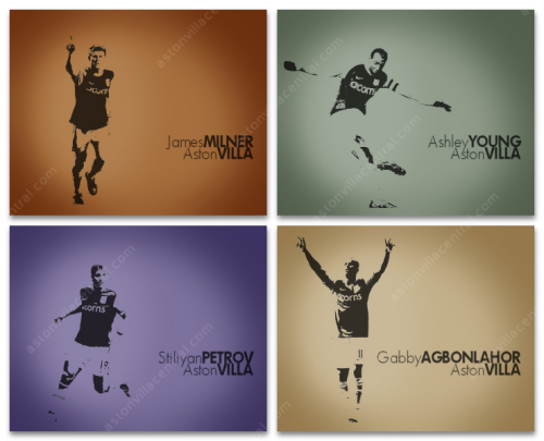
The Evolution Of Football Art With A Helping Of Fail – Part II
Written by Dan on December 18, 2009
In Part I we went behind the scenes of a failed Aston Villa wallpaper. Here in Part II we’ll take a quick look at the evolution of the wallpapers here at Aston Villa Central by touring the ones that didn’t make the cut.
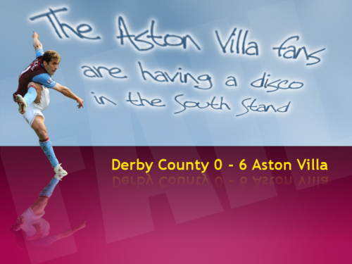
Disco In The South Stand
This was the first Aston Villa image I ever created. The picture shows Stan Petrov moments after firing his audacious effort on goal in the 6-0 destruction of Derby at Pride Park. Later in the game the travelling Villa fans could be heard singing “Let’s all have a disco, let’s all have a disco…”, and then the commentator dryly added “and the Aston Villa fans are having a disco in the south stand”.
This is a great example of how I like to capture a moment during a game or am inspired by something in particular. It was an image I just made for fun and posted in a forum where someone suggested that I should make it into a wallpaper. Unfortunately I hadn’t thought of that and made this as an 800×600 pixel image which might have been a good wallpaper size a few years ago, but these days… not so much.
Derby Montage
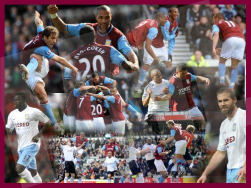
The 6-0 win at Derby obviously provided plenty of inspiration as I was playing around with this at the same time. This collage style is absolutely horrible, but for anyone just learning and struggling to get the hang of layers and masks it’s a great way for the concepts to sink in.
Once again, it was an 800×600 image so wasn’t suitable for wallpaper. Also, I learned a lesson about sourcing images – can you spot Ollie and Salifou in the bottom corners? Either they changed into the away strip to confuse the Derby players, or those pictures are from a different game.
Carew Grunge
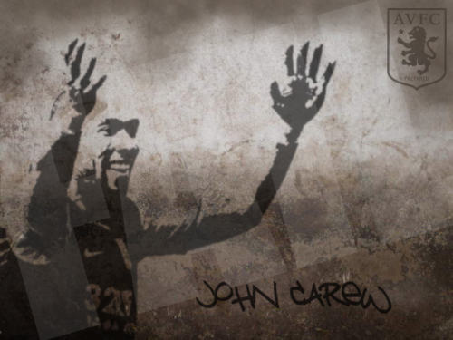
There’s a popular Gabby wallpaper that uses the grungey style, this was probably my first attempt. I went the long way round the houses to create the stencil effect of John and can do the same thing in a matter of minutes now.
For some reason I made this as a 640×480 image. Some of you may have been around long enough to remember when that was the maximum screen resolution for a desktop computer. There’s hand held mobile devices with better screen resolutions these days!
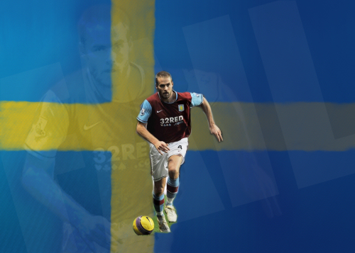
Ollie – Sweden
This is something I started playing around with towards the end of the 07/08 season, once we knew that Ollie would be leaving Villa. I wanted to create something that celebrated his time as a Villan and also tipped its hat to his Swedishness. What I found was that our Claret and Blue and Sweden’s Yellow and Blue are horrible to pull together. Abandoned.
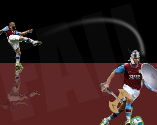
Ollie – Sandbox
I’ve no clue what I was planning on achieving with this one. I seem to be experimenting at the top with creating an airstream effect depicting the trajectory of a ball. There’s also a ripple reflection effect that I’ve used before.
And then in the bottom right there’s Ollie the Viking. It was something I made for a (de)motivational poster, but I’ve no clue what I had in mind here. This just fails on all levels.
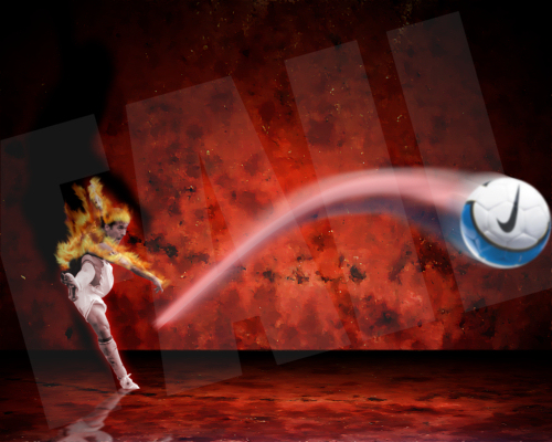
Stan – Goal From Hell
I actually quite like this one. Again with the fake ball airstream, I could have made that work eventually. And once again this is Petrov’s goal from the Derby game. I quite like the back wall and the way I’ve cast his shadow on it.
The fire effect on Stan works quite well, although I’m not sure how good it would have looked when complete. In the end I just got bored making all the little flames look right. Only a mild failure this one, definitely had potential.
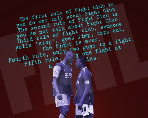
Marlon – Fight Club
Another example of a single moment in a game providing inspiration. This is Marlon Harewood and Victor Anichebe squaring up with each other towards the end of the 2-2 draw at Goodison. The two players are actually both 6’1″, but Anichebe is stood on the edge of the pitch which curved downward. As I recall the incident, it was as if Marlon straightened his back, puffed out his chest and Anichebe backed right off.
I think this was a case of a good idea, poor execution. I liked the dialogue from Fight Club in the background, this one could have been a goer with a bit of effort.
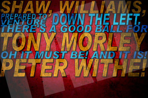
1982 Typography
When it’s done right, typography can be quite beautiful. This was my first attempt at the iconic commentary from 1982 that’s emblazoned in Villa Park. While the final version was technically a better effort, there’s a warmth to this one I failed to capture in the do over.
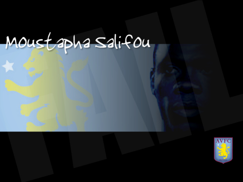
Salifou!!
Ah, good old Keith Moustapha Sali-Salifou! Hoo-ha!!
Actually, I love this one, but it needs a high resolution image of Salifou’s face. Sadly high res images of the enigma that is Salifou are rarer than rocking horse excrement. This was another 800×600 image which is about as big as the face image could probably withstand. It’s a pity, I would have loved to have been able to get this one finished.
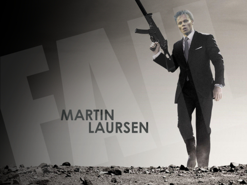
Laursen – Quantum of Solace
Anyone who has seen the version with Rick Astley’s head shooped on and the wording says “Rick Astley is… never gonna give you up” will realise how derivative some of my work can be. That’s a posh way of saying I copied someone else!!
This was something of a movie phase I was going through and I think I just forgot about this one.
Reservoir Dogs
Sticking with the movie theme, this one is complete, I just didn’t think anyone would be interested in it. The silhouette of the players is from some game or other, but isn’t recognisable enough for anyone to feel any affinity with it. Nice try, but a bit lame.
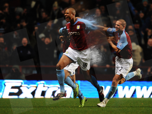
Zat Knight
This is probably one of my favourites from the unfinished collection. This was Zat celebrating after scoring the last minute equalizer at home to Arsenal on Boxing Day last year. What a goal and what a fantastic moment for a player who is a Villa fan himself.
This picture perfectly captures the exhilaration any one of us would feel in Zat’s position and what I was trying to create in this image was a sense of the whole world becoming a blur. I wanted his shirt to become a swirl of claret and blue, as if he was bursting out of one reality into a whole different world.
It’s tricky to explain exactly what I mean, but if you can imagine how Zat must have felt you can maybe get a sense of where this was heading. I wish I’d finished this one. Not the greatest player to ever grace Villa Park, but this was one of my favourite games from last season and this has to be the best moment.
So there you have it, from the very first image inspired by Stan Petrov in Derby to today. These images that were left on the drawing board detail a good portion of the journey as I’ve learned how to make what I think are pretty decent quality wallpapers.
There’s many brilliant artists out there making desktop wallpapers that are technically superior to anything you’ll find here at Aston Villa Central. However, there’s a couple of things I strive for that I think are missing in so many of the wallpaper images that I see. Firstly, when it comes to the players or the games, I’m trying to capture a moment or a feeling, maybe trying to tell a story. As a fan myself I want to share what I felt at the time as well as capture the moment from the player or game itself.
More important perhaps is the functionality. I like to keep things reasonably simple and tend to favour dark colours because at the end of day these are supposed to be desktops holding your favourite shortcuts. Images that are too bright and/or are too busy don’t lend themselves to being very useful desktops in my humble opinion.
And finally I’ll leave you with a sneak peak of what could be a huge set I’m currently working on. I’m planning on at least 14 or 15 players, the usual resolutions, plus mobile devices too. I’m not sure yet, but I may do each player in a choice of colours, I’ll have to see how much extra work that will be. (think about 15 players multiplied by 5 different sizes multiplied by 5 different colours and we’re talking about a lot of work, even if they are very simple images!!).
Facebook friends will have already seen this…
